You are not logged in.
- Topics: Active | Unanswered
#151 2007-10-12 18:04:14
- zenlord
- Member
- From: Belgium
- Registered: 2006-05-24
- Posts: 1,221
- Website
Re: Arch Linux logo concept
You know, guys, there's no reason Arch can't have more than one "semi-official" logo...
Creating semi-official logo's is IMHO not really a good thing. The linux-landscape is scattered as it is, and thus the last thing we need is more 'forking' (albeit just the logo). Besides, it would not be as gratifying for the designer(s).
Given the fact that the current official logo (as displayed on the frontpage) lacks in several areas, I think the official logo AT LEAST should get an update. And if an update is in place, I think opening up the discussion about the scope of the update is really a good thing.
I can't stress enough that this is only my opinion - I think more people should be able to give theirs and maybe even more designers should be tricked into designing a new logo ![]() . The decision what should be done with the winning logo can be made at the end of the contest, but the possibility that the current logo is replaced by something completely new should not be excluded beforehand.
. The decision what should be done with the winning logo can be made at the end of the contest, but the possibility that the current logo is replaced by something completely new should not be excluded beforehand.
'one logo to rule them all'!
Zl.
Offline
#152 2007-10-12 18:14:26
- thayer
- Fellow

- From: Vancouver, BC
- Registered: 2007-05-20
- Posts: 1,560
- Website
Re: Arch Linux logo concept
From a marketing perspective, the idea of having multiple logos for each product or release is a bad idea. Imagery is an incredibly powerful aspect of marketing and it's important to maintain a consistent identity that people can recognize at a glance.
I think the real debate at hand is whether the existing has long outlived its usefulness, in terms of representing the professionalism and maturity of Arch Linux as a viable Linux distribution, and whether or not we should correct the matter before Arch get any bigger in terms of popularity, awareness, media, etc.
Here's a sampling of distro logos... based on image alone, which vendors would you consider more professional or "trustworthy" for your desktop? I know "image" isn't everything, but for many it's the first impression that really counts. This 8-bit png is another example of why gradients aren't good for everyday use:

And here's another example, completely outside the realm of technology. If selecting randomly from a phone book, which companies would you think had better capabilities of eliminating pests (and would carry enough insurance to cover any mistakes they made (e.g. wrongful death))?

thayer williams ~ cinderwick.ca
Offline
#153 2007-10-12 18:25:54
- Cerebral
- Forum Fellow

- From: Waterloo, ON, CA
- Registered: 2005-04-08
- Posts: 3,108
- Website
Re: Arch Linux logo concept
Thayer, you've gotta stop talking, because the more you say the more I want a new logo. XD Maybe I'll bring it up on the dev mailing list sometime soon, see what others think... you've certainly sparked my interest.
Offline
#154 2007-10-12 18:38:53
- shining
- Pacman Developer

- Registered: 2006-05-10
- Posts: 2,043
Re: Arch Linux logo concept
From a marketing perspective, the idea of having multiple logos for each product or release is a bad idea. Imagery is an incredibly powerful aspect of marketing and it's important to maintain a consistent identity that people can recognize at a glance.
It's well known that marketing is Arch's first priority. You know, KI$$ philosophy.
That's actually the main reason I'm using it.
pacman roulette : pacman -S $(pacman -Slq | LANG=C sort -R | head -n $((RANDOM % 10)))
Offline
#155 2007-10-12 18:52:14
- Cerebral
- Forum Fellow
- From: Waterloo, ON, CA
- Registered: 2005-04-08
- Posts: 3,108
- Website
Re: Arch Linux logo concept
It's well known that marketing is Arch's first priority. You know, KI$$ philosophy.
That's actually the main reason I'm using it.
Eh, no reason for the sarcasm - marketing means more than just 'trying to make money' - Thayer makes good points, although some of his points are from a business perspective, the message of having a strong public face is a good one.
Offline
#156 2007-10-12 19:10:35
- thayer
- Fellow
- From: Vancouver, BC
- Registered: 2007-05-20
- Posts: 1,560
- Website
Re: Arch Linux logo concept
Cerebral, that would be awesome if you would do that. I would love to hear what the other devs have to say. If it's agreed then I do think some sort of poll or contest would be appropriate. This thread has gotten far more attention than I ever would've imagined and I think there have been some great (and diverse) concepts presented here.
Shining, I agree that KISS is the first priority for Arch and it's the primary factor that sold me on Arch in the first place, which is one of reasons I think the current logo isn't as well-suited as it could be. To me, strokes, gradients, and drop shadows in the same image are not "simple" by any means.
Last edited by thayer.w (2007-10-12 19:14:29)
thayer williams ~ cinderwick.ca
Offline
#157 2007-10-12 19:21:21
- shining
- Pacman Developer
- Registered: 2006-05-10
- Posts: 2,043
Re: Arch Linux logo concept
Shining, I agree that KISS is the first priority for Arch and it's the primary factor that sold me on Arch in the first place, which is one of reasons I think the current logo isn't as well-suited as it could be. To me, strokes, gradients, and drop shadows in the same image are not "simple" by any means.
Hm ok, now you convinced me ![]()
And btw, I appreciate your work (as well as the others in this thread), and seeing it's a community effort, it shouldn't consume too much the precious times of Arch dev. Just a bit for the actual decision maybe. So I've nothing against it (not that my opinion matters at all anyway).
pacman roulette : pacman -S $(pacman -Slq | LANG=C sort -R | head -n $((RANDOM % 10)))
Offline
#158 2007-10-12 19:27:46
- foxbunny
- Member

- From: Serbia
- Registered: 2006-10-31
- Posts: 759
- Website
Re: Arch Linux logo concept
To defend my work: the simplicity of means of creating, and simplicity of the final creation don't mix. And shouldn't be. As for marketing. If you really want to go deep into that (I work for a marketing division in my company), you have to completely give yourself up to the market, and play by the rules. The logos you presented in the first row are created in a corporate environment, which is quite different from what we, the Archers, love and cherish. I'm not saying we, the Archers, love the logo *I* created, but we are certainly NOT after corporate-backed distros such as RedHat, Mandriva, Suse, Fedora, etc. Well, at least I hope I spoke for most of us. Sry if I missed the point. ![]()
The reason I like the *current* logo the most is that it is quite different from the other logos out there. At least that aspect, IMNSHO, should remain the same. Arch *is* different, it's users are different, the target audience... etc. We work with different parameters.
Offline
#159 2007-10-12 20:21:25
- peets
- Member

- From: Montreal
- Registered: 2007-01-11
- Posts: 936
- Website
Re: Arch Linux logo concept
Here are some suggestions for the logo. Mostly, I took thayer's and made it shorter and changed the blue to green.
http://www.flypicture.com/display/NDE2NjE=
This is the first time I post a file on a forum... I'd like to share the svg but I don't have any hosting space.
Once again, good job everyone. This is exiting (even though it's just a logo!)
-ppp-
Offline
#160 2007-10-12 20:27:27
- foxbunny
- Member
- From: Serbia
- Registered: 2006-10-31
- Posts: 759
- Website
Re: Arch Linux logo concept
Hehe, there's nothing like 'just a logo' for us ppl in the graphic design business. ![]()
@others and Thayer in particular:
Anyway, I will try to create the Arch Linux brand personality illustrated with nice graphics. Will publish it here. Of course, it will be based on the stuff we have in the wiki, as well as my personal experiences with Arch Linux and Arch Community (that's right, with the capital C), as well as with some other distros I've been testing out recently.
After that, we can discuss the particulars of our logo. Okay?
Last edited by foxbunny (2007-10-12 20:45:07)
Offline
#161 2007-10-12 21:06:40
- thayer
- Fellow
- From: Vancouver, BC
- Registered: 2007-05-20
- Posts: 1,560
- Website
Re: Arch Linux logo concept
Sounds good, Fox.
With so many concepts coming to light, I thought I'd throw out some considerations for everyone to think about:
* When converted to 1 and 2 colours (e.g. solid black, solid black and something else) does the logo degrade gracefully or does the design fall apart? There are a lot of conditions that call for a single color logo, including watermarks, printing, fabrics, etc.
* Does the logo scale well at extreme sizes? A good logo should double as an icon which means it should be fairly square (with the 'archlinux' text removed) and still be meaningful at a size as small as 16x16 pixels.
* Is it KISS? Going back to what shining said earlier, Arch is all about KISS and so the logo should IMHO reflect that philosophy as well. Not to mention that overly complex graphics will fail the above recommendations... they scale poorly and fall apart at reduced colours.
* Specific colours should come as an afterthought. Whether the arrow in my alpha logo is blue or red matters little to me. It could be all white, or all black and still convey the same recognition. Users often change the colours to suit their application (wallpaper, icon, gtk style, etc.) so no single colour should be considered the only colour available.
Obviously, these are all just suggestions, but I hope they help nonetheless!
thayer williams ~ cinderwick.ca
Offline
#162 2007-10-12 21:31:38
- pjeremy
- Member
- Registered: 2007-04-03
- Posts: 66
Re: Arch Linux logo concept
Here's a sampling of distro logos... based on image alone, which vendors would you consider more professional or "trustworthy" for your desktop? I know "image" isn't everything, but for many it's the first impression that really counts. This 8-bit png is another example of why gradients aren't good for everyday use:
What's the one beneath RedHat?
Offline
#163 2007-10-12 22:02:00
- thayer
- Fellow
- From: Vancouver, BC
- Registered: 2007-05-20
- Posts: 1,560
- Website
Re: Arch Linux logo concept
That would be the Vector Linux logo. Now, tell me that one doesn't have too much going on:

Last edited by thayer.w (2007-10-12 22:07:08)
thayer williams ~ cinderwick.ca
Offline
#164 2007-10-13 00:28:20
- foxbunny
- Member
- From: Serbia
- Registered: 2006-10-31
- Posts: 759
- Website
Re: Arch Linux logo concept
Sounds good, Fox.
Okay, you seem to have already started on the technical side, so I will comment on the points one by one. But before that, let's make something clear for the rest of the non-graphics-guru people. Thayer is trying to lead us towards a one-size-fits-all type of design. That means a single logo that handles very well in all (or at least most of the) situations. This can radically simplify things, but it is NOT a requirement. Not even in the corporate arena.
Another comment, before I comment on the points below. A 'logo' is the symbol part of the graphical identity. Another part is the 'logotype' - the words. In our case, the double-arc symbol is the logo, whereas the "archlinux" text is the logotype. Just to get the possiblity of misunderstanding out of our way. ![]()
* When converted to 1 and 2 colours (e.g. solid black, solid black and something else) does the logo degrade gracefully or does the design fall apart? There are a lot of conditions that call for a single color logo, including watermarks, printing, fabrics, etc.
Let's take a look at this logo:
![]()
Yup. It's the well-known Mandriva logo. Notice the subtle gradients all over the thing? Very slick. Gives the logo som depth, and perceived weight. It's not that hard to imagine it as a single or two color, though. Just remove the gradient:

It's still the same logo, isn't it?
On the other hand, can you imagine Ubuntu logo in a single color? What color should it be? Yup, you're right. Some logos simply cannot be reproduced in 1 color. You don't really have to if it hurts the image.
Want another example? Here's Linspire:
![]()
And their favicon you can see at: http://www.linspire.com/
A bit hard to see, maybe, but no-fuss no-gradient 2 color version:
![]()
A better version is on Distrowatch.com, with an interesting logo:
http://distrowatch.com/table.php?distribution=linspire
* Does the logo scale well at extreme sizes? A good logo should double as an icon which means it should be fairly square (with the 'archlinux' text removed) and still be meaningful at a size as small as 16x16 pixels.
Remember the Geeko? The funny looking cameleon that openSUSE users just LOVE? Now, can you fit the cameleon in a square box?
Of course you can. Just visit the http://www.opensuse.org/ and take a look at the favicon (logo in grey presented at the top left corner of the page). Remove the tail, the body, the legs... well, remove everything except the head... ![]()
Also, take a look the Red-Hat logo at http://www.redhat.com/ and then look at the favicon. Neat. Just cropped the area around the mistery figure with red fedora. Why? Because the figure is the important bit. The circle around him is not. The circle would only make the logo smaller and harder to recognize as a favicon.
* Is it KISS? Going back to what shining said earlier, Arch is all about KISS and so the logo should IMHO reflect that philosophy as well. Not to mention that overly complex graphics will fail the above recommendations... they scale poorly and fall apart at reduced colours.
Okay, so you touched on this before. Let me explain visually, why your point is not as simple as you are trying to make it look.

Now this is a simple string of three letters. 'E', 'g', and another 'g'. Some fancy graphical effects applied to them, too. Now this:

No effects. Plain black on white. But it's kanji. It's complex script, very complex shapes. But no graphical effects. It will be technically simple, but conceptually complex.
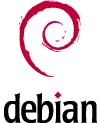
Since logo is all about being the symbol, 'standing for something', technical simplicity simply does not bear the same weight as the conceptual simplicity. The one 'simple' is not the same as the other 'simple'. Mandriva logo is conceptually quite simple, even though it uses quite subtle gradients, which may even not be reproducible on shirts. On the other hand, simple 2 color Red-Hat logo uses very complex shapes. As well as the 1 color Debian logo.
Each of the mentioned logos has its own problems and solutions. Mandriva's solution is to reduce the number of colors, Red-Hat's to crop the logo itself on some occasions, debian... well' they just simplify the logo (loose detail at smaller sizes).

* Specific colours should come as an afterthought. Whether the arrow in my alpha logo is blue or red matters little to me. It could be all white, or all black and still convey the same recognition. Users often change the colours to suit their application (wallpaper, icon, gtk style, etc.) so no single colour should be considered the only colour available.
Yes, the color. Some logos rely on color. Actually, MOST logos rely on color. And not just someone said 'Because!' There is a very good reason for that. People react more readily to color than to any other feature of an artwork. Little babies can't tell one shape from another, but they see colors. And react to them. That is why color is important. And if you want control over the brand communication, you will want to control the color as well.
Obviously, these are all just suggestions, but I hope they help nonetheless!
Yes. But you shouldn't make them principles. There are many different ways, and if more people are going to participate in this 'project', then you shouldn't restrict the way they work. Of course, some technical constraints are acceptable. Such as:
* logo needs to scale down to 16x16 px
But you need to add this:
* or have alternate 16x16 variants.
Or:
* it must be reproducible in 2 colors
But you need to add:
* or have an alternate 2-color version.
BTW, do I need to mention that the current Arch logo complies with the points made here?
Last edited by foxbunny (2007-10-13 00:52:58)
Offline
#165 2007-10-13 00:30:25
- foxbunny
- Member
- From: Serbia
- Registered: 2006-10-31
- Posts: 759
- Website
Re: Arch Linux logo concept
By the way, the VectorLinux logo is quite recognizable. ![]() Take a look at their favicon as well:
Take a look at their favicon as well:
Bad job, IMHO. Doesn't look quite the same.
BUT, apart from the favicon, take a look at this:
http://www.cafepress.com/vectorlinux
They simply NEVER reproduce the logo in less than full range of colors. So it's okay for them.
Last edited by foxbunny (2007-10-13 00:32:15)
Offline
#166 2007-10-13 01:04:11
- foxbunny
- Member
- From: Serbia
- Registered: 2006-10-31
- Posts: 759
- Website
Re: Arch Linux logo concept
I wanted to post this post-research, but here goes before more people jump into this:
Not all distros are created for the same target group. I recently did a small test to see what distro was the best for want-it-all-and-want-it-now-joe-sixpack type of user. One of the interesting conclusions was that even though some open-source companies maintain and sponsor a community edition of their enterprise distros, the result is that the community is still using a distro that was meant to be used in enterprise environment.
Nice example of this is openSUSE which is definitely an enterprise desktop Linux. PCLinuixOS, on the other hand is clearly a SOHO desktop.
The visual identity of openSUSE is, therefore, geared towards the enterprise market, as opposed to PCLinuxOS. Mandriva tries to walk the middle path, for example. But it's brand is strongly connected to the enterprise market as well. Etc, etc.
Those two groups are quite different, and people belonging to those groups are quite different.
Besides the two groups, I was able to observe at least three more: the lifestyle group of users (that's what I call them), as well as IT professionals (Gentoo, Slackware, Arch, of course), and IT enthusiasts, who will use practically anything and whose choices are harder to predicts, because they usually belong to one of the other groups as well.
This gives us the total of five possible categories into which Arch may (or may not) fit. Five groups (four usable), and four different design approaches.
I will draw up a simple chart illustrating this very soon. So if there are people interested in designing the next Arch logo (if devs agree there should be one, that is), they'd better wait untill we set the goals for the next redesign, not just technically, but also from the brand personality ('Who is Arch?' type of suff) perspective.
Last edited by foxbunny (2007-10-13 01:08:20)
Offline
#167 2007-10-13 02:57:55
- thayer
- Fellow
- From: Vancouver, BC
- Registered: 2007-05-20
- Posts: 1,560
- Website
Re: Arch Linux logo concept
oh man, I hope post #164 wasn't on my account. I didn't think I could make it any clearer that they were "all just suggestions"... a few quick points worth considering. As for Ubuntu, I think it looks just as well in black as it does in full colour:

For the record, I'm not trying to lead anyone anywhere except to open up the debate (which is apparently working ![]() ), and I hope nobody thinks otherwise. I'm not even a graphics designer, I'm a code jockey... XHTML, CSS, PHP, etc. I just like working with vector graphics as a hobby.
), and I hope nobody thinks otherwise. I'm not even a graphics designer, I'm a code jockey... XHTML, CSS, PHP, etc. I just like working with vector graphics as a hobby.
thayer williams ~ cinderwick.ca
Offline
#168 2007-10-13 04:08:31
- Cerebral
- Forum Fellow
- From: Waterloo, ON, CA
- Registered: 2005-04-08
- Posts: 3,108
- Website
Re: Arch Linux logo concept
http://archlinux.org/pipermail/arch-dev … 02158.html - I've brought it up on the ML - let's see where it goes.
Offline
#169 2007-10-13 04:54:51
- peets
- Member
- From: Montreal
- Registered: 2007-01-11
- Posts: 936
- Website
Re: Arch Linux logo concept
Good points Thayer, and good replies foxbunny. This is a necessary discussion if arch wants a new logo.
better wait untill we set the goals for the next redesign, not just technically, but also from the brand personality ('Who is Arch?' type of suff) perspective.
Yes. It seems to me like arch was started as an "enthusiast" project and aims to stay that way. However, it's good; I think I remember Judd writing that he used it in the entreprise. I use arch on my home computer, and I'm not an IT guy, but I don't see why arch shouldn't be used in the workplace. It seems ideal since it can be easily customized to fit a business' exact needs. Maybe the archlinux brand should spell robustness and quality (appealing to entreprise-type users) but still appeal to enthusiasts from any branch (geek-type users such as myself).
-ppp-
Offline
#170 2007-10-13 07:59:11
- louipc
- Member
- Registered: 2006-10-09
- Posts: 85
Re: Arch Linux logo concept
Hmm I still think the top bits are too sharp. How about just rounding the corners a little on the outside and inside but keeping the flat on the top?
My svg abilities are lacking but here's a png example:
http://louipc.dontexist.org/sample-arch.png
Otherwise it's an awesome design! Cheers.
Offline
#171 2007-10-13 08:52:55
- foxbunny
- Member
- From: Serbia
- Registered: 2006-10-31
- Posts: 759
- Website
Re: Arch Linux logo concept
oh man, I hope post #164 wasn't on my account. I didn't think I could make it any clearer that they were "all just suggestions"... a few quick points worth considering. As for Ubuntu, I think it looks just as well in black as it does in full colour:
http://www.cinderwick.ca/files/u.png
For the record, I'm not trying to lead anyone anywhere except to open up the debate (which is apparently working
), and I hope nobody thinks otherwise. I'm not even a graphics designer, I'm a code jockey... XHTML, CSS, PHP, etc. I just like working with vector graphics as a hobby.
Okay. So, I am a graphic designer, and moreover, working tightly with marketing people (not the good ones, though). And therefore I'm competent enough to say your skills are not bad at all. Quite the opposite, actually...
But, you are missing some important points there. Which is not bad in itself, but you make them sound as if those are the rules, with a small note at the bottom, so I had to intervene. ![]()
As for the Ubuntu logo, it IS harder to recognize without colors, especially since there are so many variants of Ubuntu that are using different colors and more or less the same shape. But, as I said before, you absolutely don't have to reproduce in 1 color, if you think it can hurt the design.
BTW, check out RedHat and Mandriva websites. They each have guidelines for logo use. Those are always a good read. ![]()
Offline
#172 2007-10-13 10:33:42
- gummibaerchen
- Member
- Registered: 2007-07-20
- Posts: 109
Re: Arch Linux logo concept
I like the first one better, because the "archlinux"-tag looks better imho.
Okay. You guys are making this really fun.
And better!
Also the first (left) one here ![]()
Looks more dynamic!
Here's a sampling of distro logos... based on image alone, which vendors would you consider more professional or "trustworthy" for your desktop? I know "image" isn't everything, but for many it's the first impression that really counts. This 8-bit png is another example of why gradients aren't good for everyday use:
I think your (thawyer.w) logo is doing best here from the arch ones!
Offline
#173 2007-10-13 15:14:27
- btw0
- Member
- Registered: 2006-06-25
- Posts: 9
Re: Arch Linux logo concept
I really like thayer.w's logo, it looks professional, hope it gets used asap.
Last edited by btw0 (2007-10-13 15:18:18)
Offline
#174 2007-10-13 16:56:26
- fwojciec
- Member

- Registered: 2007-05-20
- Posts: 1,411
Re: Arch Linux logo concept
Hmm I still think the top bits are too sharp. How about just rounding the corners a little on the outside and inside but keeping the flat on the top?
My svg abilities are lacking but here's a png example:http://louipc.dontexist.org/sample-arch.png
Otherwise it's an awesome design! Cheers.
This logo is actually very nice, and it probably would appeal to those who want a more round "arch" at the top of the A... Perhaps it would be good idea to post it here so it is visible directly in the thread because at the moment it's kind of hidden in that link...
Offline
#175 2007-10-13 17:07:39
- louipc
- Member
- Registered: 2006-10-09
- Posts: 85
Re: Arch Linux logo concept
Perhaps it would be good idea to post it here so it is visible directly in the thread because at the moment it's kind of hidden in that link...

Here you go for easy viewing, I scaled it down because the other one seemed too big to put in the actual post.
Edit
--------
Actually I think I'd give the inside a bigger radius.
I'll tell you one reason this appeals to me. In the mechanical engineering world you rarely see components designed with sharp corners like that because it's structurally weak - especially on the inside. Rounding out the corners makes things much stronger.
Last edited by louipc (2007-10-13 17:11:12)
Offline