You are not logged in.
- Topics: Active | Unanswered
#1 2023-12-09 19:20:14
- sergoops
- Member
- Registered: 2023-12-09
- Posts: 4
Incorrect font rendering in the gnome
All the time that I have been using arch with gnome (~2 years), there is the following problem: incorrect font rendering. It's hard to explain in words, but the sight feels that the fonts look wrong, it's very annoying. This is evident in all gtk applications, gnome-shell, gdm etc. Fonts seem to be fuzzy, crooked.
This is not visible in the screenshots, but i attached a compare of photos by phone (Default gnome cantarrel font). There are two photos: from arch and from fedora. As you can see the third letter has the "hole" in the center (circled in red). It's a cirillic letter "д" (d). It's most noticable font rendering issue, that i found. The rest is difficult to convey even with the photos.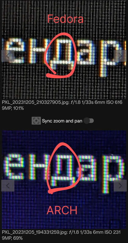
This problem is relevant for all fonts. Default cantarrel, ibm plex, apple san francisco and others which names i don't remember.
I tryed to change the font rendering settings with gnome-tweaks, edit some font configs, enable gtk-hint-font-metrics, but there is no positive outcome.
The problem exists for all monitors that i tried: 21 inch 1600x900 and 16 inch 1920x1080. Also i tried TV: 33 inch 1920x1080.
Gnome is installed using gnome group (i mean a pacman package group), so i think i haven't missed any libs.
Offline
#2 2023-12-09 21:07:17
- seth
- Member

- From: Won't reply 2 private help req
- Registered: 2012-09-03
- Posts: 77,791
Re: Incorrect font rendering in the gnome
Are those pictures from the same panel??
The colors are vastly different, but I *guess* the subpixel alignment differs,
https://wiki.archlinux.org/title/Font_c … _alignment
https://wiki.archlinux.org/title/Font_c … _rendering
No idea about gnome specifically, but eg. Qt text isn't affected?
https://wiki.archlinux.org/title/Font_c … plications
Offline
#3 2023-12-09 21:23:46
- sergoops
- Member
- Registered: 2023-12-09
- Posts: 4
Re: Incorrect font rendering in the gnome
Are those pictures from the same panel??
The colors are vastly different, but I *guess* the subpixel alignment differs,
https://wiki.archlinux.org/title/Font_c … _alignment
https://wiki.archlinux.org/title/Font_c … _renderingNo idea about gnome specifically, but eg. Qt text isn't affected?
https://wiki.archlinux.org/title/Font_c … plications
Pictures are from the same panel. These photos are unfortunate, taken in slightly different conditions. But the eye can definitely see that the fonts on arch are incorrect. I found some people from specific chats who noticed same problem with gnome in arch and some others distros which are not very popular. So, this is not my personal hallucination.
QT isn't affecter, gnome specific problem. I tried KDE.
Offline
#4 2023-12-09 21:30:00
- sergoops
- Member
- Registered: 2023-12-09
- Posts: 4
Re: Incorrect font rendering in the gnome
Are those pictures from the same panel??
The colors are vastly different, but I *guess* the subpixel alignment differs,
https://wiki.archlinux.org/title/Font_c … _alignment
https://wiki.archlinux.org/title/Font_c … _renderingNo idea about gnome specifically, but eg. Qt text isn't affected?
https://wiki.archlinux.org/title/Font_c … plications
I tried everything from your links earlier. No positive results
Offline
#5 2023-12-10 14:30:49
- seth
- Member
- From: Won't reply 2 private help req
- Registered: 2012-09-03
- Posts: 77,791
Re: Incorrect font rendering in the gnome
But the eye can definitely see that the fonts on arch are incorrect.
Maybe, but not on those photos - they're generally too different to spot significant differences.
Are you running gnome on wayland in both cases?
Does the display server matter?
Do you use fractional scaling?
Does the effect show up with super-large fonts (120pt or so)?
And can you elaborate on
you can see the third letter has the "hole" in the center (circled in red). It's a cirillic letter "д" (d)
Because, yeah, sure it does: https://en.wikipedia.org/wiki/De_(Cyrillic)
Offline