You are not logged in.
- Topics: Active | Unanswered
#1 2024-03-17 09:40:35
- Mr Green
- Forum Fellow

- From: U.K.
- Registered: 2003-12-21
- Posts: 5,930
- Website
nerd font in tmux [Solved]
Looking for a font package called nerd fonts that I can use in tmux. A package search brings up quite a nerd packages, anyone know the correct one for tmux for catppuccin theme?
Last edited by Mr Green (2024-03-17 11:25:39)
Mr Green
Offline
#2 2024-03-17 11:04:33
- Head_on_a_Stick
- Member

- From: The Wirral
- Registered: 2014-02-20
- Posts: 9,003
- Website
Re: nerd font in tmux [Solved]
Not sure what "catppuccin theme" is (I don't use tmux) but I use the ttf-jetbrains-mono-nerd terminal font, that seems to have very wide coverage and also looks nice.
Jin, Jîyan, Azadî
Offline
#3 2024-03-17 11:25:24
- Mr Green
- Forum Fellow
- From: U.K.
- Registered: 2003-12-21
- Posts: 5,930
- Website
Re: nerd font in tmux [Solved]
Quite a few packages to chose from but I will give it go, thank you ;-)
Will mark as solved
Mr Green
Offline
#4 2024-03-17 13:23:47
- seth
- Member

- From: Won't reply 2 private help req
- Registered: 2012-09-03
- Posts: 76,534
Re: nerd font in tmux [Solved]
Errrr-Hemmmm.
Aktschually, the ONLY sane choice along catppuccin is OBVIOUSLY Monofur ![]()
(I use it as second font for smaller stuff like the fluxbox toolbar and some dedicated shell programs. When it comes to serious readability, I'd as for now opt for SourceCodePro or its Nerd Variant SauceCodePro)
Offline
#5 2024-03-17 15:06:38
- Mr Green
- Forum Fellow
- From: U.K.
- Registered: 2003-12-21
- Posts: 5,930
- Website
Re: nerd font in tmux [Solved]
Will stick with ttf-dejavu-nerd for now... monofur did not quite render right [well at least on my desktop] ;-)
Mr Green
Offline
#6 2024-03-17 15:08:19
- seth
- Member
- From: Won't reply 2 private help req
- Registered: 2012-09-03
- Posts: 76,534
Re: nerd font in tmux [Solved]
Monofur has monaco/cybercafe vibes - but the name is program and various dots appear as paws ![]()
Offline
#7 2024-03-17 16:03:59
- Mr Green
- Forum Fellow
- From: U.K.
- Registered: 2003-12-21
- Posts: 5,930
- Website
Re: nerd font in tmux [Solved]
I tried it and just got vertical lines in between coloured blocks, looked awful..
Knowing me I will get bored of the pretty colours very quickly and just want icons and information rather any of the fancy stuff!
Have finally got caps-lock set as F12 so leader keys are much easier now, kind of like having a tiling window manager in a terminal.
Right I am out of here before the arch gods catch me ;-)
Mr Green
Offline
#8 2024-03-17 16:18:34
- seth
- Member
- From: Won't reply 2 private help req
- Registered: 2012-09-03
- Posts: 76,534
Re: nerd font in tmux [Solved]
I tried it and just got vertical lines in between coloured blocks, looked awful..
That doesn't sound like the feature of any one font, but before you escape:
nb. that the Nerd fonts generally tend to come in three different flavours (Normal, Mono and Propo) which looks the same but have different metrics at least in the private area and afaict at least "mono" strictly stays inside the glyph box (shrinking elements) whereas the "regular" version will in doubt overflow.
So if you've https://www.compart.com/en/unicode/U+2588 that doesn't fill the entire box (creating the vertical lines) you probably selected the "… Nerd Font Mono" variant?
(DejaVu has the same split)
Or you selected the font in a process older than it's installation and only got tofus ![]()
Monofur looks like http://0x0.st/Xr8V.png
Offline
#9 2024-03-17 16:37:49
- Mr Green
- Forum Fellow
- From: U.K.
- Registered: 2003-12-21
- Posts: 5,930
- Website
Re: nerd font in tmux [Solved]
Will check out what I have installed and set up, normally I just run with Dejavu..or Ubuntu fonts.
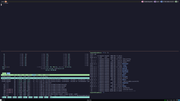
Did have cmus running in top pane but you do not want to listen to my extreme metal ;-)
Mr Green
Offline
#10 2024-03-17 17:10:44
- seth
- Member
- From: Won't reply 2 private help req
- Registered: 2012-09-03
- Posts: 76,534
Re: nerd font in tmux [Solved]
Not necessarily death- or speed-, otherwise…
If you're concerning the things in the top bar, that looks like some powerline or starship and apparently a misaligned powerline glyph (\uE0B4 & \uE0B6) - and the font isn't monofur, looks like DejaVu Sans Mono
Might be an outfall of https://github.com/ryanoasis/nerd-fonts/issues/1056 but I'd have to look into that myself (this is probably TE-related and fixing it towards one TE breaks it in the other or so…)
Offline
#11 2024-03-18 08:29:57
- seth
- Member
- From: Won't reply 2 private help req
- Registered: 2012-09-03
- Posts: 76,534
Re: nerd font in tmux [Solved]
Fwwi, alacritty works _somewhat_ fine w/ saucecode pro and
# Point size
  size: 10.0

  # Offset is the extra space around each character. `offset.y` can be thought of
  # as modifying the line spacing, and `offset.x` as modifying the letter spacing.
  offset:
    x: 0
    y: -1
but
printf '\ue0b6\e[30;47mLCARS\e[0m\ue0b4\n' will have a discolored line before the right half-circle, what is most likely related to subpixel hinting.
https://github.com/alacritty/alacritty/issues/4552
https://github.com/alacritty/alacritty/issues/3756
YMMV, but it's /very/ size and offset sensitive.
Edit: the lcdlegacy filter will prevent the discolored lines (lcdnone anyway) but isn't as pretty as lcddefault.
Last edited by seth (2024-03-18 16:03:28)
Offline