You are not logged in.
- Topics: Active | Unanswered
#26 2006-07-08 12:25:05
- baze
- Member
- Registered: 2005-10-30
- Posts: 393
Re: new website....
Site looks good, it's a lot cleaner than the old one. But there is one important feature missing:
* Sorting packages (last update, repro, etc...)
yep, those arren't hyperlinks anymore ![]()
Offline
#27 2006-07-08 12:29:15
- Pierre
- Developer

- From: Bonn
- Registered: 2004-07-05
- Posts: 1,967
- Website
Re: new website....
* the blogs are missing
* it would be nice to be able comment the news
Offline
#28 2006-07-08 16:10:56
- magnum_opus
- Member
- Registered: 2005-01-26
- Posts: 132
Re: new website....
also, this new layout plays much nicer with text browsers
Offline
#29 2006-07-08 16:52:51
- deficite
- Member

- From: Augusta, GA
- Registered: 2005-06-02
- Posts: 693
Re: new website....
Finally! I've been wanting a new site design for quite some time. Looks good guys, and I'm glad we look somewhat professional now. The last design looked very programmerish (spoken from the mouth of a programmer)
Offline
#30 2006-07-08 17:46:24
- Snowman
- Developer/Forum Fellow

- From: Montreal, Canada
- Registered: 2004-08-20
- Posts: 5,212
Re: new website....
* the blogs are missing
The blogs are there under Community Links:
->Planet Arch
->Development Blog
* it would be nice to be able comment the news
I don't think it's a good idea. I would prefer to keep the frontpage news clean. After all, they are just there to make annonoucements not to start discussions. It's also not necessarry as most important news items are followed by an announcement in the forum where users can comment. If there is no forum announcement, you can always create a thread.
Offline
#31 2006-07-08 17:52:00
- Galdona
- Member
- Registered: 2006-03-15
- Posts: 196
Re: new website....
cactus is right the site doesnt resize well
Offline
#32 2006-07-08 19:39:37
- Ibex
- Member
- Registered: 2006-03-02
- Posts: 135
Re: new website....
Hmmm, with the new RSS feeds, I get some weird "J"-looking character after every entry. Both with the news and with the packages.
Is there any way to browse trough the latest added packages? Like sorting by date?
Offline
#33 2006-07-08 19:58:23
- veek
- Member
- Registered: 2006-03-10
- Posts: 167
Re: new website....
My initial impression is that I like it! Good stuff.
Offline
#34 2006-07-08 21:12:57
- Eugenia
- Member
- From: Bay Area, CA, USA
- Registered: 2005-03-08
- Posts: 74
- Website
Re: new website....
I like the new Arch Linux web site design but it has problems, as The_Nerd demonstrated in his screenshots. I get the same problems with Safari. Additionally, the web site now requires 1024x768 to render correctly, which is really not desirable. Most of the sites on the net still design for 800x600 and I want it this way too, because I have my browser next to my IM client, and so my browser's window is not bigger than SVGA, even if my screen is XGA.
1. Please fix the problem with the floats (don't use so many please) on safari/firefox
2. Make it work correctly on SVGA screens
3. Add back the link that gets you to a page that shows a big list with all the new packages released from ALL the repos. This used to exist in the old front page.
thanks.
Offline
#35 2006-07-08 23:16:46
- 1c3d0g
- Member
- Registered: 2006-07-05
- Posts: 81
Re: new website....
Whoever made the new website, congrats! ![]() It's very nice. 8)
It's very nice. 8)
Offline
#36 2006-07-09 01:39:02
- Bitmap
- Member
- Registered: 2006-01-27
- Posts: 8
Re: new website....
The design and layout is a lot cleaner than the old one. I think the "welcome" box should be smaller though. It's not the most important thing on the page at all, yet for some reason it's the largest.
Also, the package search looks out of place and has too much white space around it. Ideally, the welcome box would be even with the side boxes, and the search box would be in one of the package side boxes.
But I'm just being picky. ![]() It's a lot better than the old one overall, so great job.
It's a lot better than the old one overall, so great job.
Offline
#37 2006-07-09 02:11:02
- Gullible Jones
- Member

- Registered: 2004-12-29
- Posts: 4,863
Re: new website....
Nice, but what happened to the "More..." link under the recent package updates listing? That's not huge but it is nice to be able to see somewhat less recent updates. :?
Offline
#38 2006-07-09 02:41:54
- benplaut
- Member
- Registered: 2006-06-13
- Posts: 383
Re: new website....
wow... looks alot like the ubuntu site ![]()
Next on the list:
matching forum style
matching mediawiki style
I know a *tiny* bit about mediawiki theming, i'll see if i can come up with something
<edit>
just noticed, the 'blog' link from the forums is dead
Offline
#39 2006-07-09 02:47:08
- allucid
- Member
- Registered: 2006-01-06
- Posts: 259
Re: new website....
wow... looks alot like the ubuntu site
Fortunately, the forums don't look like ubuntu's. Their forums are godawful to try and navigate.
Offline
#40 2006-07-09 03:14:57
- benplaut
- Member
- Registered: 2006-06-13
- Posts: 383
Re: new website....
benplaut wrote:wow... looks alot like the ubuntu site
Fortunately, the forums don't look like ubuntu's. Their forums are godawful to try and navigate.
agreed... the latest layout by kassetra and co. is horrible ![]()
Offline
#41 2006-07-09 17:54:15
- iBertus
- Member
- From: Greenville, NC
- Registered: 2004-11-04
- Posts: 2,228
Re: new website....
Overall, it's a nice, simple yet not ugly, look for the Arch site. I think it looks better than the sites of some other distros. Congrats to all involved!
Offline
#42 2006-07-10 18:18:32
- Bjørn
- Member

- From: The Netherlands
- Registered: 2004-03-18
- Posts: 139
- Website
Re: new website....
I really like the new website too, but in my opinion the package search link is misplaced and wastes a lot of space. I know whitespace is essential in a nice layout, but I think a lot of it could be avoided by moving package search in the sidebar, as follows:
Left is current, right has search in sidebar:
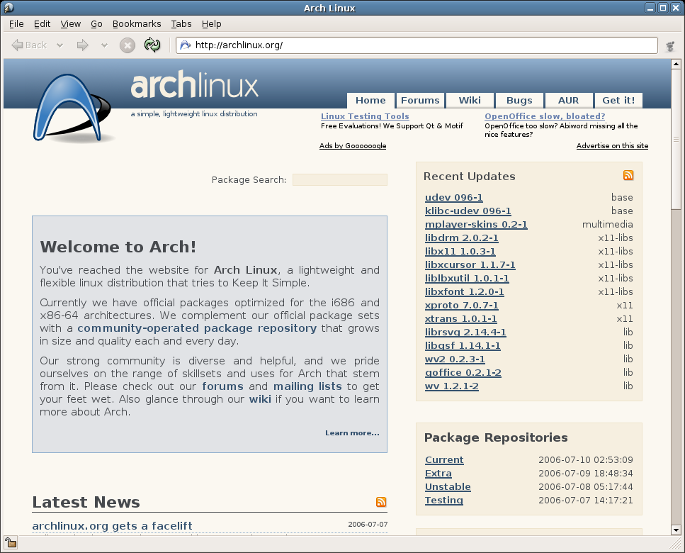
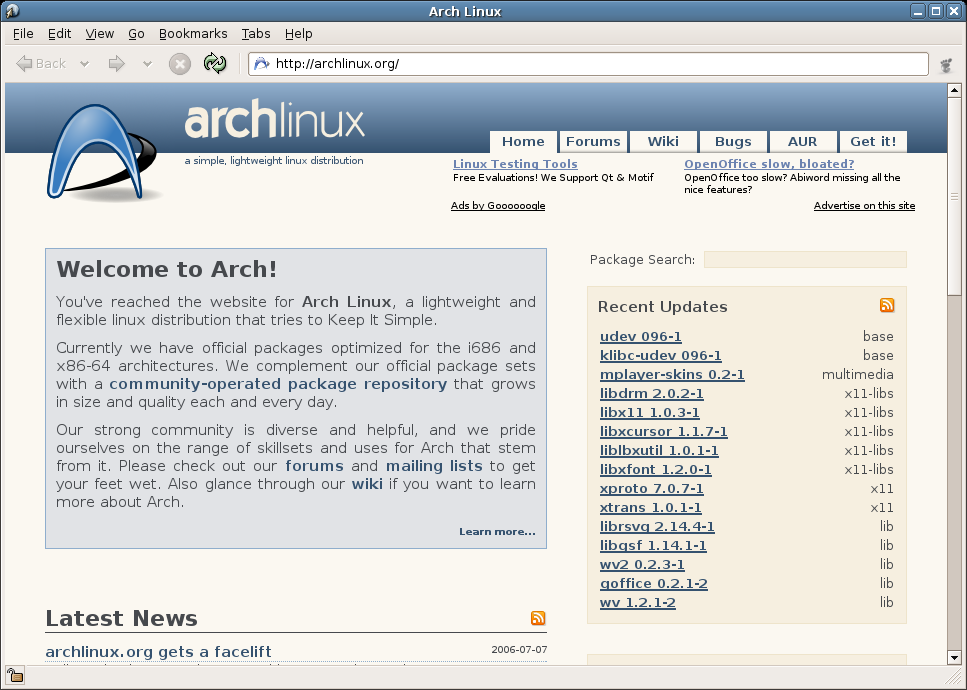
I also reduced the margins at the top and bottom of the blue welcome box (maybe a bit too much, but I think they're too large on the current version).
http://themanaworld.org/
A Free Real-time Massively Multiplayer Online RPG in development.
Offline
#43 2006-07-10 21:19:17
- baze
- Member
- Registered: 2005-10-30
- Posts: 393
Re: new website....
i like your improved suggestion, but the upper border of the blue welcome box and the entry field of the package search should be at the same height.
and i think the margins between the items at the right side should be equal.
Offline
#44 2006-07-10 21:53:24
- Bjørn
- Member
- From: The Netherlands
- Registered: 2004-03-18
- Posts: 139
- Website
Re: new website....
i like your improved suggestion, but the upper border of the blue welcome box and the entry field of the package search should be at the same height.
and i think the margins between the items at the right side should be equal.
I agree, well noted. :-)
http://themanaworld.org/
A Free Real-time Massively Multiplayer Online RPG in development.
Offline
#45 2006-07-10 21:55:48
- stonecrest
- Member

- From: Boulder
- Registered: 2005-01-22
- Posts: 1,190
Re: new website....
I really like the new website too, but in my opinion the package search link is misplaced and wastes a lot of space. I know whitespace is essential in a nice layout, but I think a lot of it could be avoided by moving package search in the sidebar, as follows:
This is definitely an improvement, imo. I hope it gets implemented.
(P.S. The RSS feeds are still nonfunctional.)
I am a gated community.
Offline
#46 2006-07-10 22:13:11
- cactus
- Taco Eater

- From: t͈̫̹ͨa͖͕͎̱͈ͨ͆ć̥̖̝o̫̫̼s͈̭̱̞͍̃!̰
- Registered: 2004-05-25
- Posts: 4,622
- Website
Re: new website....
And *please* make the text left aligned. I hate justified text with a passion...
or should I say..
I hate justified text with a passion.o.O
"Be conservative in what you send; be liberal in what you accept." -- Postel's Law
"tacos" -- Cactus' Law
"t̥͍͎̪̪͗a̴̻̩͈͚ͨc̠o̩̙͈ͫͅs͙͎̙͊ ͔͇̫̜t͎̳̀a̜̞̗ͩc̗͍͚o̲̯̿s̖̣̤̙͌ ̖̜̈ț̰̫͓ạ̪͖̳c̲͎͕̰̯̃̈o͉ͅs̪ͪ ̜̻̖̜͕" -- -̖͚̫̙̓-̺̠͇ͤ̃ ̜̪̜ͯZ͔̗̭̞ͪA̝͈̙͖̩L͉̠̺͓G̙̞̦͖O̳̗͍
Offline
#47 2006-07-11 06:01:55
- dogfin
- Member

- From: WA, USA
- Registered: 2006-04-04
- Posts: 10
Re: new website....
Its an okay layout. But I'm not a huge fan of it. The old layout is still better to me. I feel like the only person so far thats said it though. hehe. I can't quite place what bothers me about it, but I think its the colors.
The package description pages seem to have too small of a font going on. And jumping straight to the page when theres only one result has bothered me on every site thats done it. Now I feel bad for saying all that stuff.
Offline
#48 2006-07-11 08:57:42
- Bjørn
- Member
- From: The Netherlands
- Registered: 2004-03-18
- Posts: 139
- Website
Re: new website....
The package description pages seem to have too small of a font going on. And jumping straight to the page when theres only one result has bothered me on every site thats done it. Now I feel bad for saying all that stuff.
I also don't like that tiny font though, and indeed the jumping is quite annoying.
http://themanaworld.org/
A Free Real-time Massively Multiplayer Online RPG in development.
Offline
#49 2006-07-12 11:12:42
- FoPref
- Member
- From: Erlangen / Germany
- Registered: 2004-03-24
- Posts: 96
- Website
Re: new website....
I don't like the way the news are presented. You start to read them and it's ugly to do so. Finally you click on the news title to bring it up in good layout.
This could be improved, or at least a seperate "read this item" or so link should be there. Or even, like it was on the old website, an easy opportunity to read all news in good layout.
Other than that, I really <b>like the package search link where it is</b>. This makes the page look very clean!
It would look crowded otherwise.
Even on my desktop, where the browser window has 990x700 or so, it still is no problem with the waste. Yeah, you have to scroll to see older news..
Offline
#50 2006-07-12 21:17:46
- baze
- Member
- Registered: 2005-10-30
- Posts: 393
Re: new website....
i just noticed the new changes:
- alignment is better now
- package search is moved to upper left corner
- space between categories is equeal
- columns are sortable again in the repos
- "next" (previously "more") is back in the repos
nice :>
the only thing i don't really like now is the screen for a specific package (for example http://www.archlinux.org/packages/4019/)
i think the colors don't really fit the rest of the page and the layout was better before, imho.
Offline