You are not logged in.
- Topics: Active | Unanswered
#1 2009-01-31 13:23:06
- Zibi1981
- Member

- From: Poland
- Registered: 2008-01-31
- Posts: 644
OpenOffice.org color scheme - menus difficult to read
I'm using the newest available, stable version of OpenOffice.org (3.0.1) and it works quite well, but there's one thing that's making my cooperation with it somewhat more difficult, than it should be. The default color scheme is O.K., although I would also like to give a try to different one (haven't found any). In the default "back-light" is some kind of dark grey and AFAIK it cannot be changed. It wouldn't be a problem at all if the letters of the menus wouldn't be black...even while they are back-lighted. It's quite difficult for me to properly explain this in English, so I've made a screenshot, so everyone could see what I mean.

Is it a way to change the color of the "back-light"? Or maybe there's an option for making the letters go white if back-lighted (as it is while browsing for a new file to open)? And finally where to get more color schemes for OO?
Thanks in advance ![]()
"... being a Linux user is sort of like living in a house inhabited by a large family of carpenters and architects. Every morning when you wake up, the house is a little different. Maybe there is a new turret, or some walls have moved. Or perhaps someone has temporarily removed the floor under your bed."
MSI Raider GE78HX 13VI-032PL
Offline
#2 2009-01-31 13:41:27
- userlander
- Member

- Registered: 2008-08-23
- Posts: 413
Re: OpenOffice.org color scheme - menus difficult to read
I don't really use open office all that much, but isn't that handled in the window manager or DE? what desktop are you using?
Offline
#3 2009-01-31 14:32:19
- Zibi1981
- Member
- From: Poland
- Registered: 2008-01-31
- Posts: 644
Re: OpenOffice.org color scheme - menus difficult to read
KDE3mod 3.5.10. You could be right, but i.e. in Konqueror the back-lighted letters in the menus are becoming white, so they could be easily seen. I don't know how to make this happen in OpenOffice.org, hence my question.
"... being a Linux user is sort of like living in a house inhabited by a large family of carpenters and architects. Every morning when you wake up, the house is a little different. Maybe there is a new turret, or some walls have moved. Or perhaps someone has temporarily removed the floor under your bed."
MSI Raider GE78HX 13VI-032PL
Offline
#4 2009-01-31 15:12:49
- pointone
- Wiki Admin

- From: Waterloo, ON
- Registered: 2008-02-21
- Posts: 379
Re: OpenOffice.org color scheme - menus difficult to read
OpenOffice.org is a GTK app. KDE is Qt-based. Install gtk-chtheme and change your GTK theme to something more to your liking.
M*cr*s*ft: Who needs quality when you have marketing?
Offline
#5 2009-01-31 15:33:37
- Zibi1981
- Member
- From: Poland
- Registered: 2008-01-31
- Posts: 644
Re: OpenOffice.org color scheme - menus difficult to read
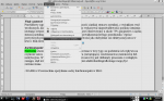
Yes, I knew that and I've already had kdemod3-gtk-qt-engine and gtk-chtheme. Unfortunately the color scheme I've chosen didn't want to cooperate with OpenOffice.org as I wanted it to. Fortunately I've found a (partial and temporary) solution ![]() The only thing I did was to mark off one little option in KDE's Control Centre. Below is the screenshot as i don't know exactly how it's called in English.
The only thing I did was to mark off one little option in KDE's Control Centre. Below is the screenshot as i don't know exactly how it's called in English.

Now OpenOffice menus look like this
I know it's a workaround and it doesn't solve my problem the way I wanted, but until I'll find a real solution this is better than reading black letter on a dark-grey background. Thanks for the suggestions ![]()
"... being a Linux user is sort of like living in a house inhabited by a large family of carpenters and architects. Every morning when you wake up, the house is a little different. Maybe there is a new turret, or some walls have moved. Or perhaps someone has temporarily removed the floor under your bed."
MSI Raider GE78HX 13VI-032PL
Offline