You are not logged in.
- Topics: Active | Unanswered
#1 2009-04-22 02:18:50
- ShadowKyogre
- Member

- From: Hell! XP No... I'm not telling
- Registered: 2008-12-19
- Posts: 476
- Website
Out of boredom, I did another spin on the Arch Logo
Does anyone remember the ArchSE thread I made? Well...I decided to rethink the logo...I think I did worse on the shading.
New: 3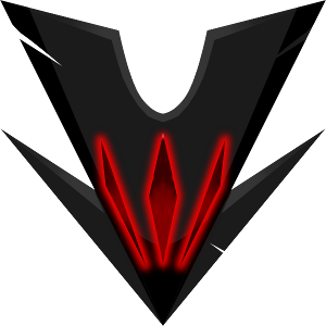
Original: 4
Which looks better to you?
Last edited by ShadowKyogre (2009-04-23 23:32:22)
For every problem, there is a solution that is:
Clean
Simple and most of all...wrong!
Github page
Offline
#2 2009-04-22 02:23:13
- Inxsible
- Forum Fellow

- From: Chicago
- Registered: 2008-06-09
- Posts: 9,183
Re: Out of boredom, I did another spin on the Arch Logo
The black one looks like Wolverine scratched it ![]()
The red one is a little too bright for my tastes, especially in the middle.
Last edited by Inxsible (2009-04-22 02:23:49)
There's no such thing as a stupid question, but there sure are a lot of inquisitive idiots !
Offline
#3 2009-04-22 02:28:57
- evr
- Arch Linux f@h Team Member
- Registered: 2009-01-23
- Posts: 554
Re: Out of boredom, I did another spin on the Arch Logo
i like the "original" red one more ![]()
Offline
#4 2009-04-22 02:30:24
- ShadowKyogre
- Member
- From: Hell! XP No... I'm not telling
- Registered: 2008-12-19
- Posts: 476
- Website
Re: Out of boredom, I did another spin on the Arch Logo
Ah, okay. I wonder what the others think ![]()
For every problem, there is a solution that is:
Clean
Simple and most of all...wrong!
Github page
Offline
#5 2009-04-22 04:43:38
- ShadowKyogre
- Member
- From: Hell! XP No... I'm not telling
- Registered: 2008-12-19
- Posts: 476
- Website
Re: Out of boredom, I did another spin on the Arch Logo
Made two versions of a wallpaper I made for us Arch Linux users: http://shadowkyogre.deviantart.com/art/ … -120079681
There are two versions because of the logo differences. Besides that, how is it? *the individual files are in a tar.gz on the dA page*
For every problem, there is a solution that is:
Clean
Simple and most of all...wrong!
Github page
Offline
#6 2009-04-22 04:49:14
- dr/owned
- Member
- Registered: 2009-01-09
- Posts: 136
Re: Out of boredom, I did another spin on the Arch Logo
I'm a bit perturbed by the fact that the A is upside down hehe but I like the creativity.
Just nitpicking:
some texturing would be good...to avoid that plastic feel of solid colors.
softening up the lines and edges a bit might tone down how agressive the logo is. Not to say that arch user wouldn't go kick the @#*$ out of Ubuntu users ![]()
Last edited by dr/owned (2009-04-22 04:49:32)
Offline
#7 2009-04-22 05:31:51
- xaiviax
- Member

- From: Michigan
- Registered: 2008-11-04
- Posts: 282
Re: Out of boredom, I did another spin on the Arch Logo
I like the new one...
Offline
#8 2009-04-22 08:04:18
- DonVla
- Member

- From: Bonn, Germany
- Registered: 2007-06-07
- Posts: 997
Re: Out of boredom, I did another spin on the Arch Logo
Ah, okay. I wonder what the others think
it looks like "the dark side of arch".
nice though!
Offline
#9 2009-04-22 12:49:05
- ShadowKyogre
- Member
- From: Hell! XP No... I'm not telling
- Registered: 2008-12-19
- Posts: 476
- Website
Re: Out of boredom, I did another spin on the Arch Logo
@dr/owned: I can't seem to think of other symbols of evil that don't involve turning the A upside down ![]() Anyway, I could make the logos appear as if they were on metal.
Anyway, I could make the logos appear as if they were on metal.
@xalviax: Okay ^^
@DonVla: Precisely what I was going for! ![]()
For every problem, there is a solution that is:
Clean
Simple and most of all...wrong!
Github page
Offline
#10 2009-04-22 13:08:57
- hatten
- Arch Linux f@h Team Member

- From: Sweden, Borlange
- Registered: 2009-02-23
- Posts: 736
Re: Out of boredom, I did another spin on the Arch Logo
2nd's the best
Offline
#11 2009-04-22 13:13:52
- Wra!th
- Member

- Registered: 2009-03-31
- Posts: 342
Re: Out of boredom, I did another spin on the Arch Logo
Not bad but this is not an "A" anymore...
Afterall...the distro is not "Glassy Spikes Linux"...it's "A"rchlinux
Last edited by Wra!th (2009-04-22 13:14:40)
MacGregor DESPITE THEM!
7f 45 4c 46 01 01 01 00 00 00 00 00 00 00 00 00
Offline
#12 2009-04-22 13:53:59
- dr/owned
- Member
- Registered: 2009-01-09
- Posts: 136
Re: Out of boredom, I did another spin on the Arch Logo
We could always change the name to GS Linux...sounds pretty badass ![]()
Offline
#13 2009-04-22 14:39:18
- evilgold
- Member
- Registered: 2008-10-30
- Posts: 120
Re: Out of boredom, I did another spin on the Arch Logo
Nice work
I like the new one best. The old one is kind of missing a shadow or something. the 'A' part of the logo is much more visible in the new one, I think because you have a clear indication of depth on it.
Offline
#14 2009-04-22 15:40:12
- Netsu
- Member

- From: Poland
- Registered: 2009-04-04
- Posts: 182
Re: Out of boredom, I did another spin on the Arch Logo
The new black one looks just like an inverted arrow, I like the older one better.
My Elegant Pattern GTK theme.
My game development blog, now on a new site.
'~/.xinitrc is an Archer's DE' - moljac024
Offline
#15 2009-04-22 15:48:30
- ShadowKyogre
- Member
- From: Hell! XP No... I'm not telling
- Registered: 2008-12-19
- Posts: 476
- Website
Re: Out of boredom, I did another spin on the Arch Logo
@evilgold: Thank you. I was intending the old logo to look something like a pentagram, while the newer one was meant to be a combination between a dragon's head and the Arch Linux logo.
@Netsu: Ah, okay. I suppose there was more originality to the original from your point of view. Am I right?
@dr/owned: What would GS stand for? ![]() I've been also thinking of changing the color scheme to black and violet after I saw your post about the least used colors for Linux distros and your wallpaper for Arch Linux.
I've been also thinking of changing the color scheme to black and violet after I saw your post about the least used colors for Linux distros and your wallpaper for Arch Linux.
Last edited by ShadowKyogre (2009-04-22 15:54:51)
For every problem, there is a solution that is:
Clean
Simple and most of all...wrong!
Github page
Offline
#16 2009-04-22 16:34:36
- buttons
- Member

- From: NJ, USA
- Registered: 2007-08-04
- Posts: 620
Re: Out of boredom, I did another spin on the Arch Logo
Scarlet letter distro.
Cthulhu For President!
Offline
#17 2009-04-22 17:12:26
- dr/owned
- Member
- Registered: 2009-01-09
- Posts: 136
Re: Out of boredom, I did another spin on the Arch Logo
GS Linux - Glass Spikes Linux or Godly Simple Linux ![]()
Be careful though if you want to mix purple in. I've found just color experimenting that purple and black really clash quite a bit for some reason. If you mix in a bit of white with the purple (but don't make it pink or magenta) and use gray for accents it seems to make purple more palatable.
Last edited by dr/owned (2009-04-22 17:15:04)
Offline
#18 2009-04-22 19:34:47
- ShadowKyogre
- Member
- From: Hell! XP No... I'm not telling
- Registered: 2008-12-19
- Posts: 476
- Website
Re: Out of boredom, I did another spin on the Arch Logo
@dr/owned: Ah, okay. I will keep that in mind. I also have two color schemes ready for people to use. One involves red on dark red in the text box (for stealthy users like me ![]() ) or violet on dark violet (more visible). Should I post screencaps of how each color scheme looks too?
) or violet on dark violet (more visible). Should I post screencaps of how each color scheme looks too?
@buttons: I knows ![]()
For every problem, there is a solution that is:
Clean
Simple and most of all...wrong!
Github page
Offline
#19 2009-04-22 23:09:38
- dr/owned
- Member
- Registered: 2009-01-09
- Posts: 136
Re: Out of boredom, I did another spin on the Arch Logo
Here's a shade of purple which I believe would work well on the 1st one: (sorry about there being no white background...it was being weird)

The red outline around it was a bit of an accident but I think it makes it look even better.
And just for kicks, could you rotate it 180 degrees and shift the upper A down about halfway?
Last edited by dr/owned (2009-04-22 23:10:56)
Offline
#20 2009-04-22 23:16:20
- dr/owned
- Member
- Registered: 2009-01-09
- Posts: 136
Re: Out of boredom, I did another spin on the Arch Logo
Hum, now you have me intrigued cause I see the possibilities of this being merged with my logo in the other thread. 180 degree rotation, and replace the big A with my yellow one, keep the colored scratches then keep the dark top arrow...hmm let me see if I can mock it up using copy and paste ![]()
No no no its horrible, the scratches look like hanging bananas ![]()
Last edited by dr/owned (2009-04-22 23:22:06)
Offline
#21 2009-04-23 00:12:49
- ShadowKyogre
- Member
- From: Hell! XP No... I'm not telling
- Registered: 2008-12-19
- Posts: 476
- Website
Re: Out of boredom, I did another spin on the Arch Logo
@dr/owned post 1: That is definitely the shade of purple I was thinking! 8D
@dr/owned post 2: Yay! ...does it really look like hanging bananas?
Also got the color schemes up: http://shadowkyogre.deviantart.com/art/ … -120162697
Last edited by ShadowKyogre (2009-04-23 00:22:18)
For every problem, there is a solution that is:
Clean
Simple and most of all...wrong!
Github page
Offline
#22 2009-04-23 00:28:41
- Lexion
- Member

- Registered: 2008-03-23
- Posts: 510
Re: Out of boredom, I did another spin on the Arch Logo
Bluerate them!
urxvtc / wmii / zsh / configs / onebluecat.net
Arch will not hold your hand
Offline
#23 2009-04-23 00:40:05
- ShadowKyogre
- Member
- From: Hell! XP No... I'm not telling
- Registered: 2008-12-19
- Posts: 476
- Website
Re: Out of boredom, I did another spin on the Arch Logo
@Lexion: :? I also added a blueviolet variant of the color scheme.
For every problem, there is a solution that is:
Clean
Simple and most of all...wrong!
Github page
Offline
#24 2009-04-23 15:36:55
- ShadowKyogre
- Member
- From: Hell! XP No... I'm not telling
- Registered: 2008-12-19
- Posts: 476
- Website
Re: Out of boredom, I did another spin on the Arch Logo
If anyone has better spinoff ideas for the Arch Linux logo, please tell me ^^
For every problem, there is a solution that is:
Clean
Simple and most of all...wrong!
Github page
Offline
#25 2009-04-23 18:03:42
- hatten
- Arch Linux f@h Team Member
- From: Sweden, Borlange
- Registered: 2009-02-23
- Posts: 736
Re: Out of boredom, I did another spin on the Arch Logo
turn them "right side down" i liked them better that way
Offline